As a UX/UI designer, one of the biggest challenges I face is the long journey from idea to prototype. We spend time writing requirements, sketching, refining, and polishing. By the time something usable is ready, the team has often been waiting for weeks. That waiting slows projects down and makes collaboration harder than it needs to be.
I’ve been experimenting with ways to make that process faster without losing quality. Recently, I tried Figma Make, a tool that turns prompts directly into working React applications. It does not replace design, but it helps create something tangible that a team can click through and test almost immediately.
If you’ve ever been on a cross-functional team, this will sound familiar:
The problem? The “real” version of a product often doesn’t appear until much later in the cycle. And when it finally does, it usually sparks yet another round of back-and-forth. The result is delay, rework, and frustration across the board.
What impressed me about Figma Make was not that it “designs for you” (it doesn’t), but that it reduces the distance between an idea and a prototype. Here’s what stood out:
At the same time, there are real limitations:
We tested Figma Make on an internal estimating tool for a client. The users were long-time Excel veterans, so the challenge was to create something clear and familiar without overwhelming them.
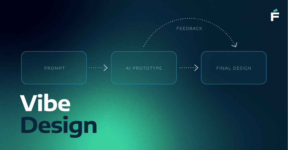
Here’s how we approached it:

The result? Stakeholders were clicking through ideas in days, not weeks. The design team still owned the craft in Figma, but we were no longer starting from a blank page.
This shift isn’t just about designers saving time. It’s about aligning product, design, and engineering earlier in the process. When teams can validate ideas sooner, they reduce rework, gain clarity before heavy investment, and keep morale high by moving at the pace of conversation.
AI is not replacing design quality. It is, however, accelerating clarity so designers can spend their time on what really matters: making thoughtful, consistent, human-centered experiences.
What worked well:
What didn’t:
Designers who want to speed up ideation and give stakeholders something real to respond to.
Product owners/analysts who need a reference before committing design resources.
Developers who want to discuss structure earlier, grounded in something clickable.
AI will not replace design. What it does is shorten the time it takes to get something real in front of people. For me, the real promise lies in how tools like Figma Make reduce friction, surface new ideas, and give teams a head start.
The craft, empathy, and strategic thinking of design still matter. But with AI as a partner, we can spend less time chasing pixels in the early stages and more time delivering meaningful, human-centered experiences.
Let's talk about where you are today and where you want to go - our experts are ready to help you move forward.