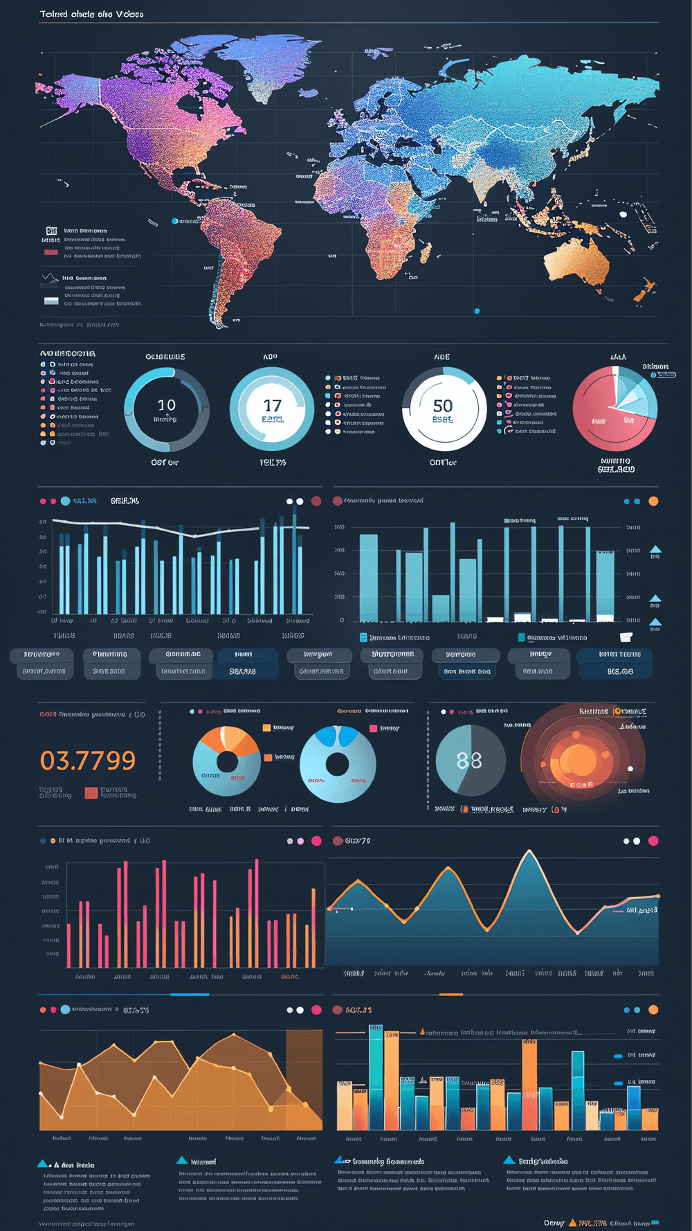
As businesses become increasingly data-driven, the demand for effective data visualization tools continues to grow. Whether it's for presenting trends, uncovering insights, or making critical decisions, visualization plays a crucial role in transforming raw data into a format that’s easy to understand and act upon.
But the question remains: with so many data visualization solutions available, which one is right for your business? In this post, I’ll break down some of the most popular options on the market and help you decide which is the best fit for your needs.
At its core, data visualization is about telling a story with your data. Whether it’s through interactive dashboards or simple charts, good visualization can highlight key metrics, trends, and insights that guide decision-making. But more importantly, it allows non-technical stakeholders to grasp complex information quickly, helping businesses make data-driven decisions without getting lost in the numbers.
So, what are your options for building these visualizations?

When thinking about data analytics tools, business intelligence (BI) platforms such as Tableau, Power BI, and Looker often come to mind. These tools are well-established and designed to provide a smooth user experience, especially for those who might not have a deep technical background.
Why BI Platforms Work:
- User-Friendly: One of the biggest advantages is ease of use. These platforms are designed with the business user in mind, offering intuitive drag-and-drop interfaces.
- Wide Adoption: These solutions are widely adopted and offer strong support for integration with various data sources, making them ideal for cross-departmental usage.
Limitations:
- Cost: Licensing fees can add up, especially for smaller teams or those working with tight budgets.
- Customization: While they’re flexible enough for most business needs, users might find the customization options a bit limited for more specialized visualizations.

For businesses with a technical team in place, JavaScript libraries like D3.js or Chart.js offer endless possibilities. They allow for highly customized, interactive visualizations tailored specifically to your business needs.
Why JavaScript Libraries Might Be the Answer:
- Flexibility: JavaScript libraries are extremely flexible, enabling you to build unique and complex visualizations that BI platforms might not be able to handle.
- Integration: These libraries fit seamlessly into existing web applications, giving you more control over how and where the data is presented.
Challenges:
- Requires Expertise: While powerful, these libraries require experienced developers to manage and maintain.
- Longer Development Time: Building a custom visualization from scratch takes time, especially when compared to out-of-the-box solutions.
For teams already familiar with Python, Python-based visualization libraries such as Matplotlib and Seaborn can be an excellent middle ground. These tools offer a balance between ease of use and flexibility, particularly for data scientists or machine learning engineers.
Advantages:
- Python Ecosystem: If your team is already using Python, integrating these libraries into your workflow is straightforward.
- Prototyping: These tools are excellent for rapid prototyping, allowing teams to quickly iterate on visualizations before embedding them into production.
Considerations:
- Web Integration: Embedding Python-based visualizations into web applications can be more cumbersome compared to JavaScript libraries.
- Customization Limits: While Python tools offer some flexibility, they may not be able to deliver the same level of interactivity as JavaScript-based solutions.

If your organization lacks the technical capacity to build custom visualizations, API-driven applications provide a more straightforward option. These third-party tools generate visualizations based on the data you provide, saving you the trouble of managing the infrastructure.
Key Benefits:
- Low Technical Overhead: With API-driven applications, you don’t need a team of developers to create visualizations. Simply provide the data, and the platform takes care of the rest.
- Scalability: Many of these platforms are built to handle large datasets without additional effort from your team.
Drawbacks:
- Limited Customization: You’ll be constrained by the platform’s capabilities, which can limit your ability to fine-tune the visualizations to your liking.
- Data Dependency: API-driven applications often require your data to be structured in a specific way, adding an extra step in your data pipeline.
Even with all the advanced tools available today, spreadsheet software like Excel and Google Sheets continues to play a role in data visualization for many businesses. These tools are easily accessible, familiar to most users, and often sufficient for basic data analysis and charting.
What Works:
- Simplicity: Almost everyone knows how to use Excel or Google Sheets, making them a great starting point for quick, ad-hoc analysis.
- Cost-Effective: If you already have access to these tools, there’s no need for additional investments in software.
The Drawbacks:
- Limited Scalability: Spreadsheets struggle with larger datasets and complex visualizations.
- Collaboration Issues: As teams grow, managing changes and edits across multiple users can become difficult.

When selecting a data visualization tool, it’s important to factor in your team’s needs, budget, and level of technical expertise. Here's a quick breakdown of the key considerations:

At the end of the day, the right data visualization solution depends on your specific needs. Whether you’re looking for an out-of-the-box solution like Power BI or a fully customized approach using D3.js, understanding the trade-offs of each option is key to making the right decision.
If you’re unsure which tool is the best fit for your organization, we’re here to help. Our team has experience implementing data visualization solutions across industries and can guide you in finding the best fit for your business. Let’s connect today to get started.